
Emora: Helping autistic children understand emotions in real time
My Roles
UX and Industrial Designer
Designed the end-to-end UI and interactions across the kid-facing app, parent companion app, and wearable feedback system.
UX Researcher
Conducted primary and secondary research to uncover gaps in sensory overload, distraction, and stigma that shaped the product's design principles.
Tools
Figma, Procreate, Rhino 8, Canva, Perplexity
Team
3 UX Designers
1 Illustrator
Overview
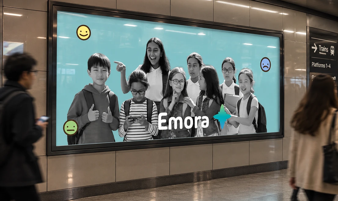
Emora is a speculative emotion-aware wearable ecosystem that helps autistic children (ages 4–12) read emotions of people. This was made during SCAD Startup 2026 where the theme was design for connection.
On this project I worked across three roles: I designed the UI, interactions, and end-to-end app experience for the kid and parent apps; conducted the secondary research into the assistive-tech landscape and autism literature that shaped our core design principles; and led the industrial design of the glasses and bracelet hardware.
Impact
Confidence to Engage
Helps kids check in on feelings without freezing or guessing, making it easier to join in instead of pulling back.
Skills Beyond
the GlassesSkills Beyond the Glasses
Repeated real-time practice builds emotional habits that carry into everyday moments beyond the device.
What is Emora?
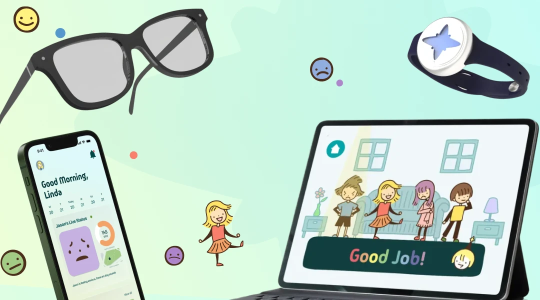
Emora is an emotion-aware wearable ecosystem that helps autistic children ages 4–12 interpret tone and body language in real time. Smart glasses detect emotional cues, a haptic bracelet translates them into subtle feedback, and companion apps turn those moments into lasting emotional understanding without taking the child feel different.
The Problem
For many autistic children, everyday conversations can move too quickly to process. Tone, facial expressions, and body language can be difficult to interpret, turning simple moments, from a sibling's joke to a parent's disappointment, into confusion and stress. Over time, this can affect confidence and make meaningful social interactions harder to navigate.
Nearly 2 out of 3 Children with Autism Struggle to Recognize Emotions
World Health Organization
Secondary Research
Why Existing Solutions Fall Short
I researched existing assistive-tech solutions and autism literature, uncovering recurring gaps in sensory load, distraction, emotional understanding, privacy, and stigma.
Key Takeaway #1
The need is large and growing
With 1 in 36 U.S. children diagnosed with ASD, the need for accessible emotional-support tools is growing but real-time emotional understanding remains underserved. This revealed an opportunity to design for a growing population, not a niche edge case.
1 in 31 U.S. 8-year-olds are identified with ASD
World Health Organization
Key Takeaway #2
Labeling ≠ Understanding.
Many existing tools teach kids to name a static face as “happy” or “sad,” but autistic children can often already do that. The harder gap is reading tone of voice and body language live, in a moving conversation.
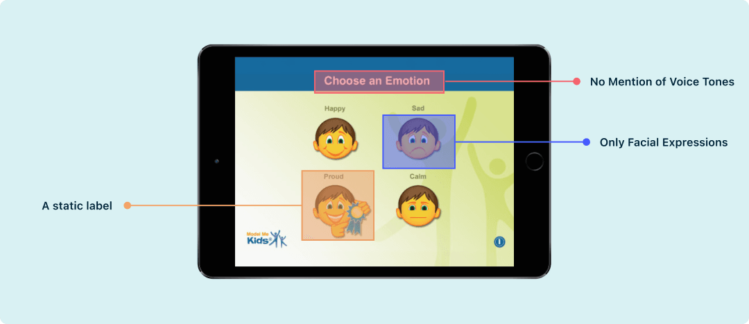
No tone of voice anywhere
There's no audio at all, no spoken line, pitch, or pacing to read. Vocal prosody is a documented, separate difficulty from face-reading.
Head only, no body language
Faces float alone with no posture, gesture, or shoulders. Reading a body in space is a distinct skill from reading a face.
A one-tap label, not a live moment
The task is to “pick the matching label,” answered in isolation with no back-and-forth. It never asks a child to read a cue as it unfolds.
Key Takeaway #3
Sensory-heavy feedback backfires.
Earlier AR-glasses approaches relied on visual and audio cues that overwhelm children and distract from the conversation. This pointed to a need for subtle, peripheral feedback for devices.
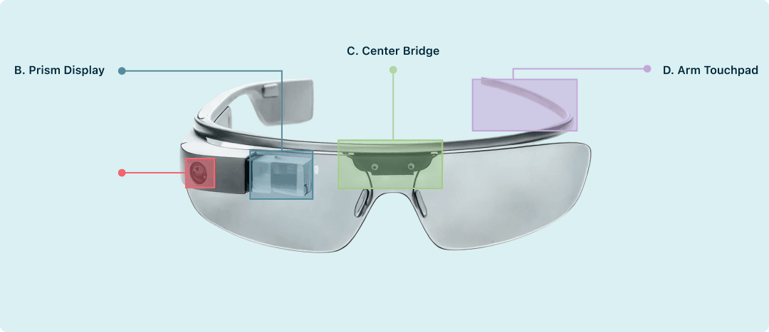
Too much feedback, all at once
The camera, display, speaker, and touchpad can all activate simultaneously, layering visual, audio, and tactile stimulation.
The technology pulls attention away from people
The display competes with eye contact, while the touchpad and visible camera can interrupt interaction and add stigma. Instead of fading into the background, the technology can become the center of attention.
Information Built for Experts
Trained on specific faces and fixed emotion categories, the system oversimplifies real-world social cues which risks teaching kids an oversimplified read of faces rather than real body language or situations.
Key Takeaway #4
Cost and stigma block adoption.
Based on market research, comparable devices retail above $1,000 and often look clinical, which discourages both purchase and everyday wear.
From Research to Sketches
Creating Wireframes and User Flows
Building Emora's Identity
Emora's visual language is intentionally soft and low-arousal, using pastel colors and warm tones to reduce sensory overload without sacrificing clarity. Rounded typography reinforces this approach, creating an interface that feels approachable, easy to read, and calming for young users.
Design Strategy #1
Technology That Blends In
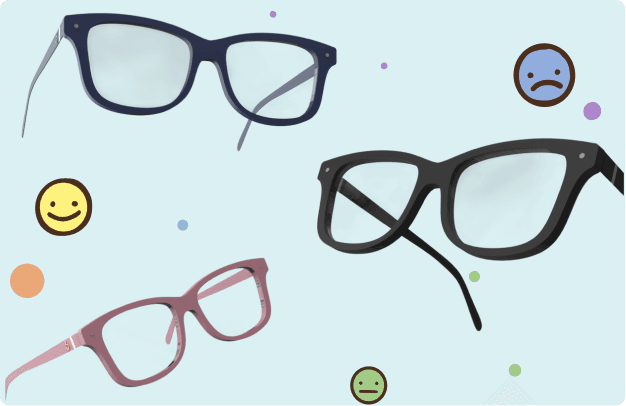
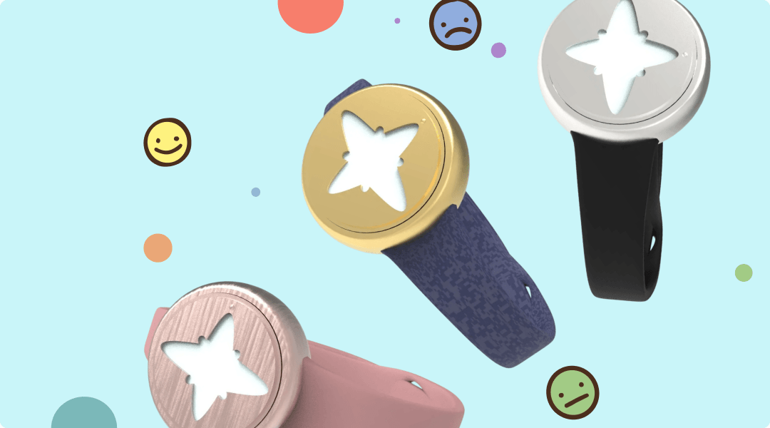
We designed Emora's glasses and bracelet to blend seamlessly into everyday life, using familiar forms that feel like ordinary eyewear and a smartwatch rather than assistive devices.

Design Strategy #2
Quiet, Non-Disruptive Feedback
Emora adapts to the child's environment, using subtle haptic and color feedback when needed while reducing stimulation during sleep, pauses, and quieter moments, keeping attention on the conversation, not the technology.
Solution #1: Kid App
Repetition over correction.
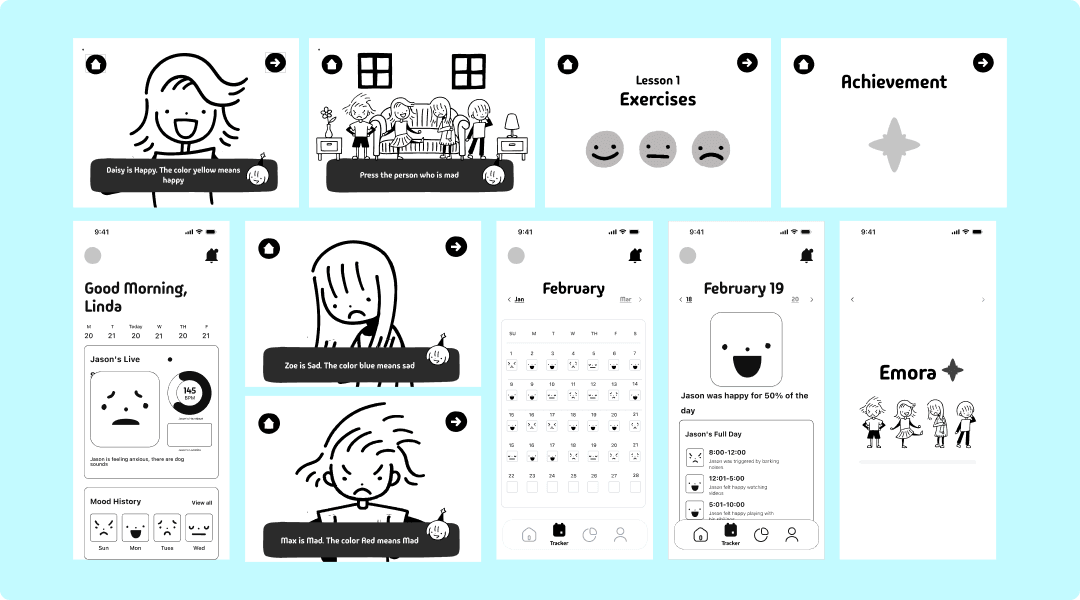
The loop is forgiving and low-stakes: kids retry freely, and copy stays encouraging (“Good Job!”) rather than corrective, so getting it wrong doesn't add to the stress the product is trying to reduce.
Solution #1: Kid App
One concept per screen.
Each screen shows a single character, a single emotion, and a single color, a direct response to the sensory-overload insight from research, where competing stimuli were flagged as overwhelming.
Solution #2: Parent Companion App
Glanceable first, historical second
The home screen leads with the single most relevant thing, how the child is doing right now, before any calendar or trend data, so a parent gets an answer in the time it takes to open the app.
Solution #2: Parent Companion App
The Calendar as a pattern-finder
The calendar surfaces patterns over time, so a moment that felt like a one-off starts to read as part of a trend a parent can act on.
Solution #3 Bracelet
Feedback happens at the wrist, not the face
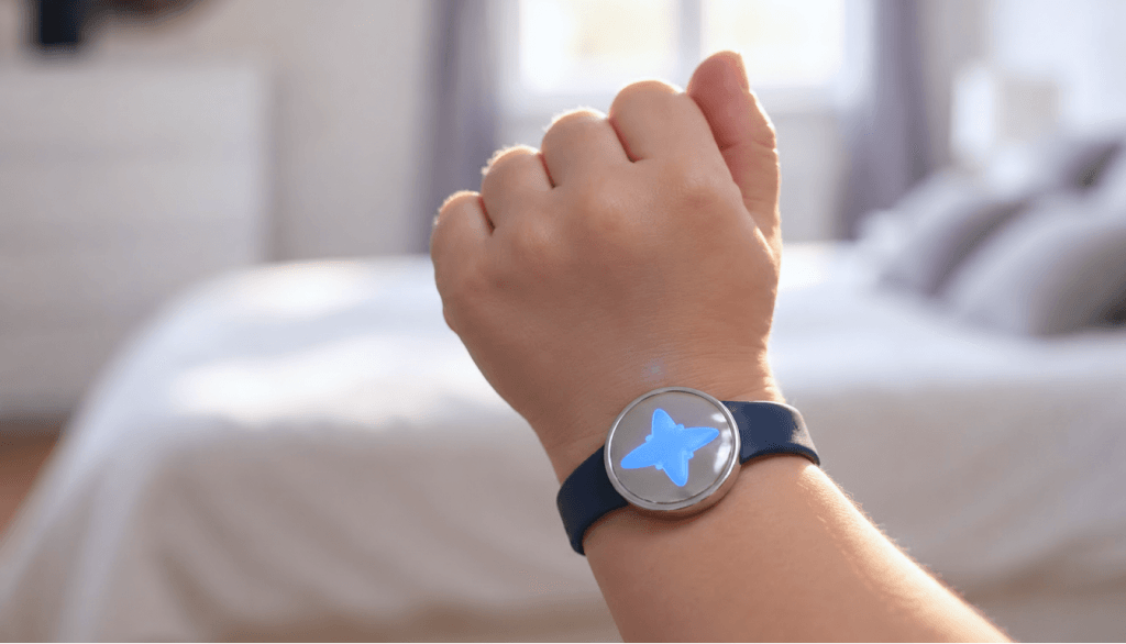
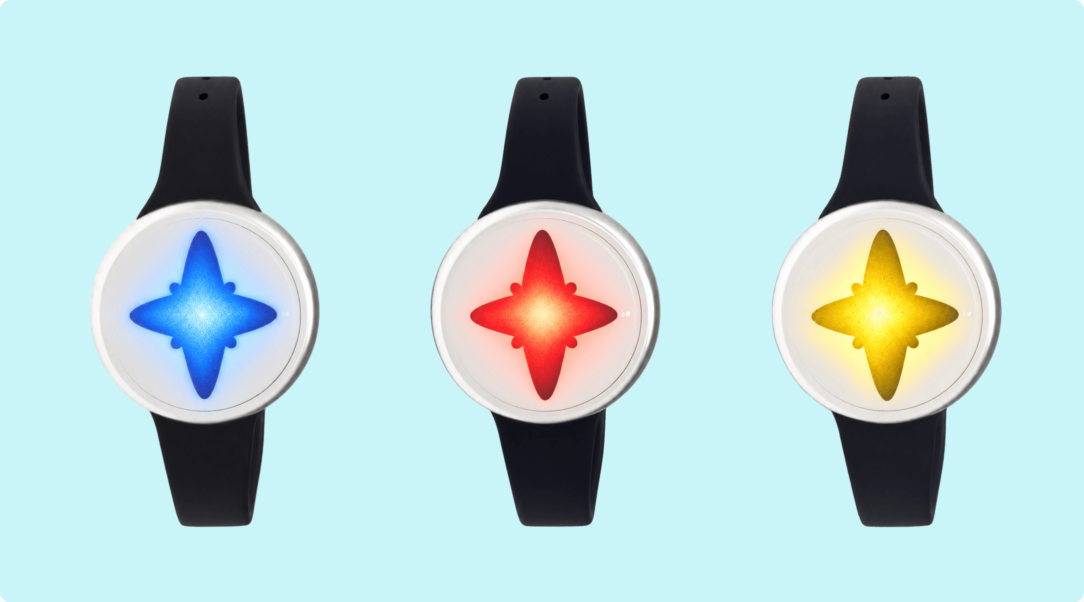
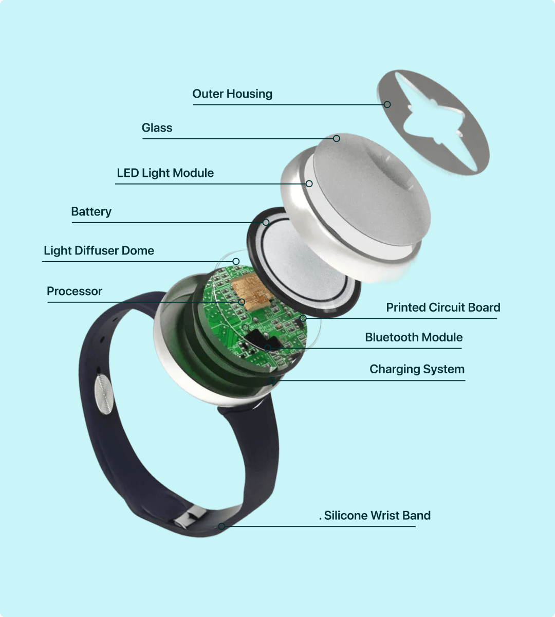
The bracelet uses a familiar smartwatch form with a soft silicone band and circular face. Subtle color and vibration deliver feedback at the wrist, while compact internals keep the exterior minimal, discreet, and distraction-free.
Solution #4 Glasses
Ordinary silhouette, hidden tech
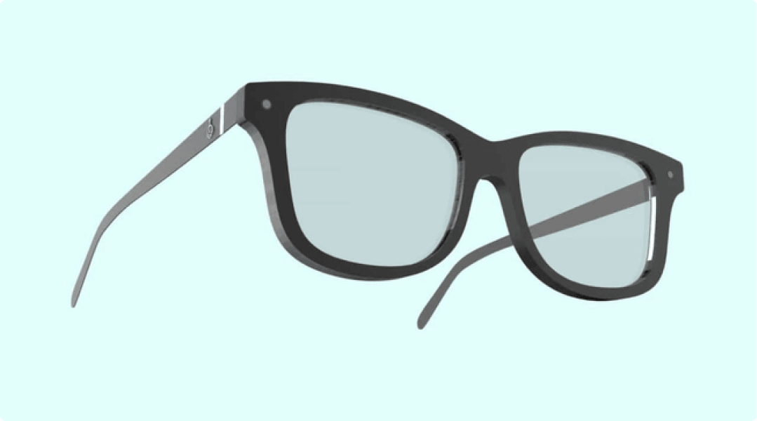
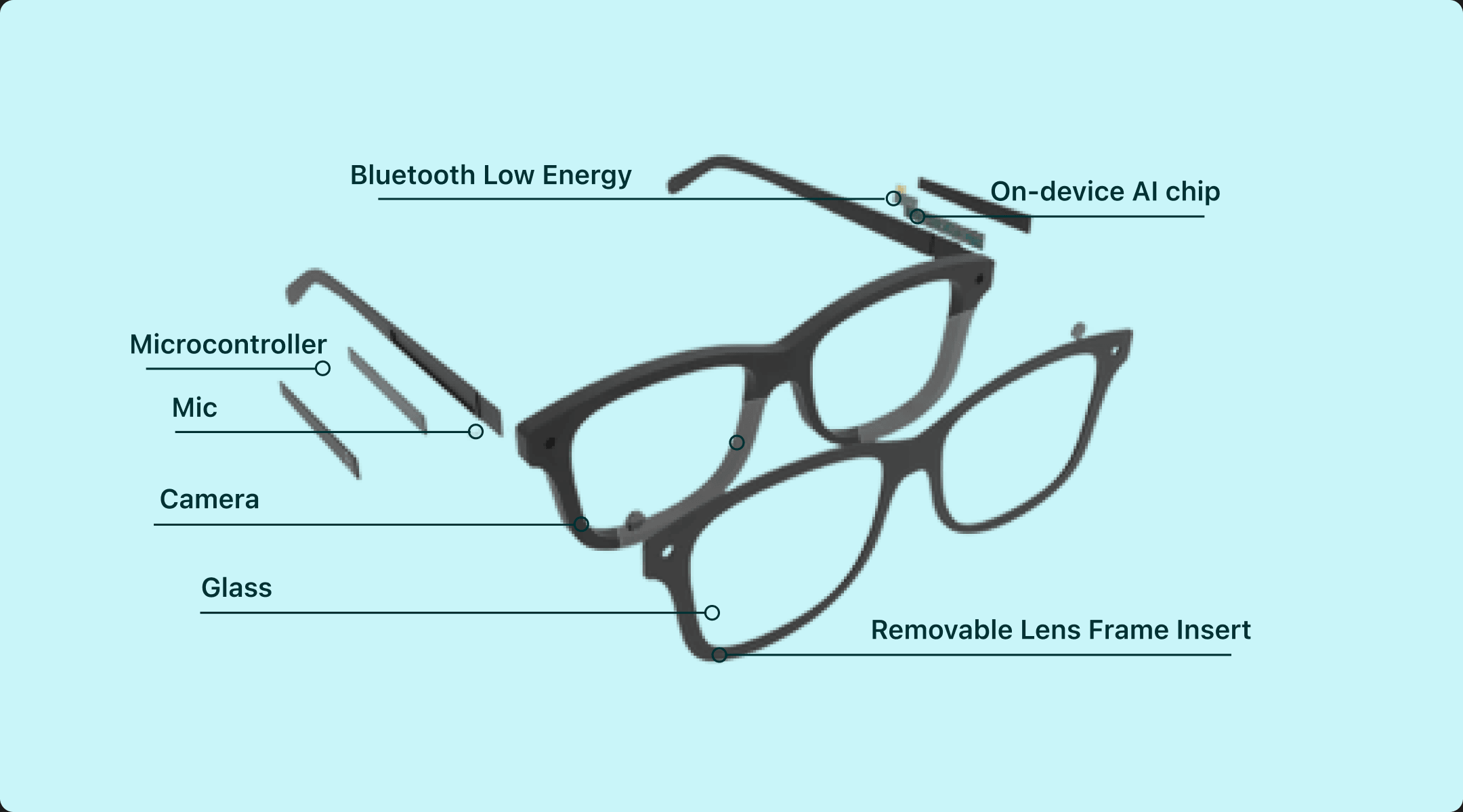
Emora uses a familiar frame that discreetly integrates its technology into the temple arms, avoiding a clinical “sensor” appearance. A flexible TR90 frame and removable lens insert allow the glasses to adjust and grow.
Business Model
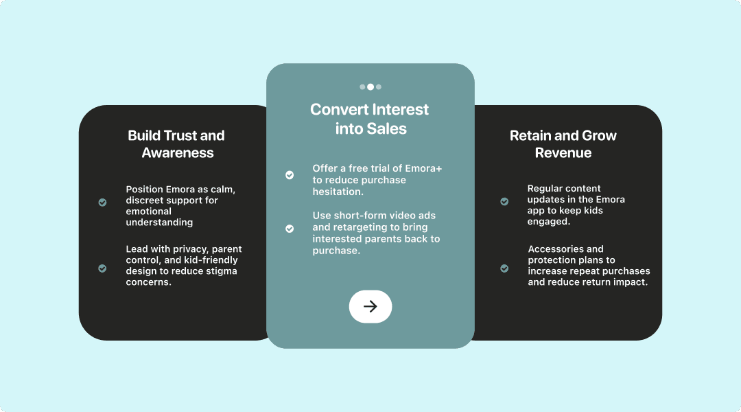
Business Model & Validation Path
Emora's growth strategy moves in three stages: building trust before asking for a purchase, converting interest with low-commitment offers, and retaining families through ongoing engagement and recurring revenue.
Key Learning #1
Storytelling Creates Buy-In
Learning from my professor, I realized that a polished interface isn't enough if people don't understand why the decisions were made. Connecting the problem, research, and solution through storytelling and presentation makes it more impactful.
Key Learning #2
Think Beyond The Product
At first, I thought redesigning the interface was the solution. Research showed me that awareness was just as important, because even the best experience can't help people if they don't know it exists.