
Deloitte: Reimagining Public Health Data
Collection; 84% Faster & Confident
My Roles
Creative Lead
Led 13 designers, directing creative across UI, storyboards, video, and marketing assets in collaboration with strategy, project, and client teams.
Design Engineer
Conducted user interviews, IA, design systems, and high-fidelity prototyping in Figma and Claude Code.
Graphic Designer
Designed assets such as the process book, campaign posters and presentation decks.
Tools
Figma, Adobe Illustrator,
Gemini, Google Adobe Indesign
Team
6 Designers
5 Strategists
3 Product Managers
3 Client stakeholders

This Project is Under NDA
Due to NDA restrictions, product visuals and implementation details are redacted; process and outcomes reflect my contributions.
Overview
Public Health reporting systems rely on public participation, yet many reports never get submitted. The problem wasn't a lack of willingness, it was an experience that felt overwhelming, fragmented, and difficult to trust.
Working alongside Deloitte, our SCADpro team reimagined a public health platform to make reporting faster, clearer, and approachable while maintaining the privacy, accessibility, and standards of a government service.
Impact
Reduction in completion time 12 → 2 minutes
of users confident in their adverse event report
Created a design system built for future development.
Context
A reporting platform is only as valuable as
the data it receives.

I didn't know a sore arm was worth reporting.
Participant #6

I've had a headache.
Participant #4
My arm is swollen where I got it.
Participant #1
My chest feels a little tight right now.
Participant #3
I broke out in hives an hour later.
Participant #5
I wish someone had followed up with me.
Participant #11
I've felt dizzy since I stood up.
Participant #1
I feel more tired than usual today.
Participant #8
My joints have been achy all day.
Participant #12
Empty data means missed insights.
Without enough reported events, statistics remain incomplete, trends stay hidden, and opportunities to improve outcomes are lost.
Secondary Research
An experience that hadn't evolved
The public health platform has changed very little since 2017. It didn't align with users' modern expectations. Outdated interaction patterns, lengthy forms, and dense interfaces increased cognitive load and slowed users.
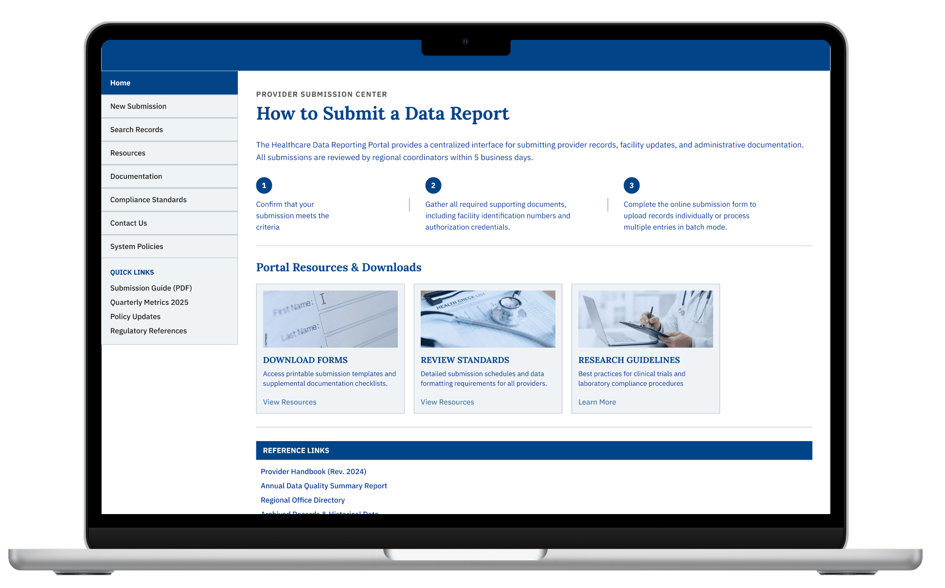
This visual has been heavily modified for confidentiality. Analysis and conclusions reflect the original source material.
An experience that hadn't evolved
Information was difficult to navigate, key actions were buried, and an overly complex experience made even simple tasks feel unnecessarily difficult.
One Need, Disconnected Paths
Users jumped between separate pages and tools just to complete a single report. Without clear guidance or feedback, many struggled to understand where they were in the process.
Information Built for Experts
Important information relied on technical terminology and scattered resources, making the platform difficult to navigate for everyday users.
Primary Research
Listening Before Designing
37 Interviews
from 15 Participants (Ages 35–53): Patients, Caregivers, and Clinicians
122 Survey Responses
from 100 Respondents (Ages 19–62) Patients, Caregivers, and Clinicians
150+ Data Points
Analyzed, Synthesize, and Turned Into Actionable Insights
Finding #1
Different people needed different experiences
One workflow couldn't serve every user. Our research revealed three distinct user needs, yet one workflow couldn't support them all, creating unnecessary friction.
General Public

Need multi-language support and plain, jargon-free guidance
Caregivers
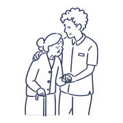
Need plain language, clear guidance, and human support when reporting
Clinicians

Need a reporting flow that fits seamlessly into their existing workflow
Finding #2
Users need clarity and feedback to build confidence and completion
Users need clearer terminology, contextual guidance, and reassurance to feel confident throughout the process.
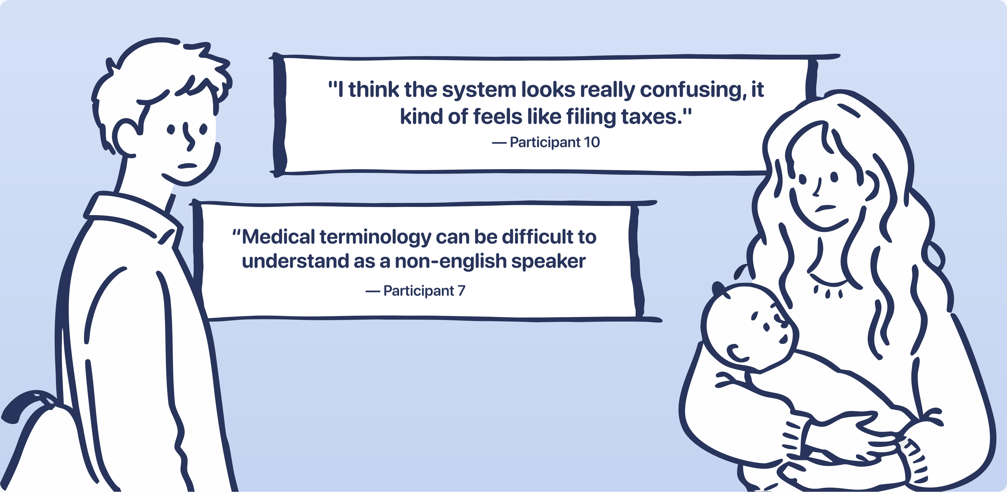
Finding #3
Awareness was just as important as usability
Many participants didn't know the platform existed or that they were even allowed to submit reports. Willingness to contribute increased once participants understood how reporting supported broader public safety efforts.
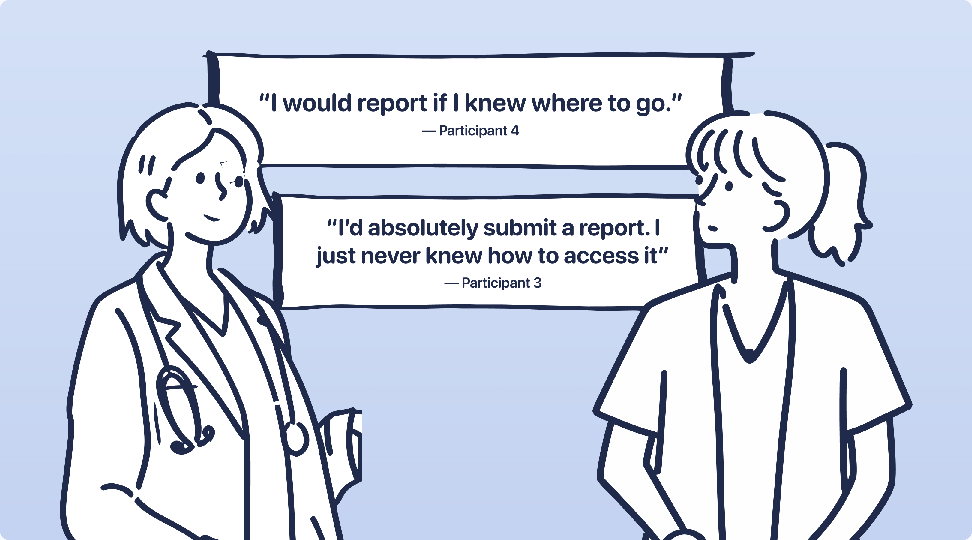
Finding #4
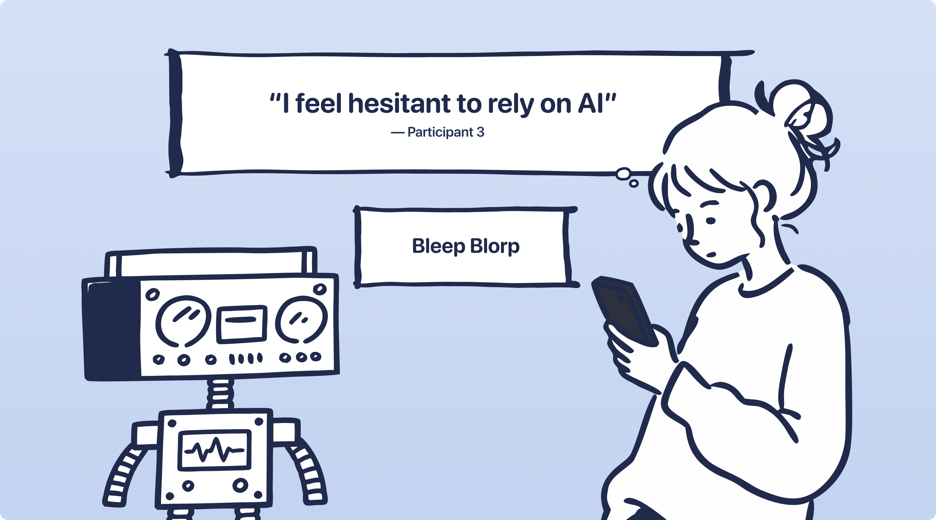
People are hesitant to give AI information
While the client envisioned AI as the centerpiece, participants hesitated to share sensitive health data with AI, citing concerns around sharing sensitive health information and privacy
The Challenge
Designing Between Realities
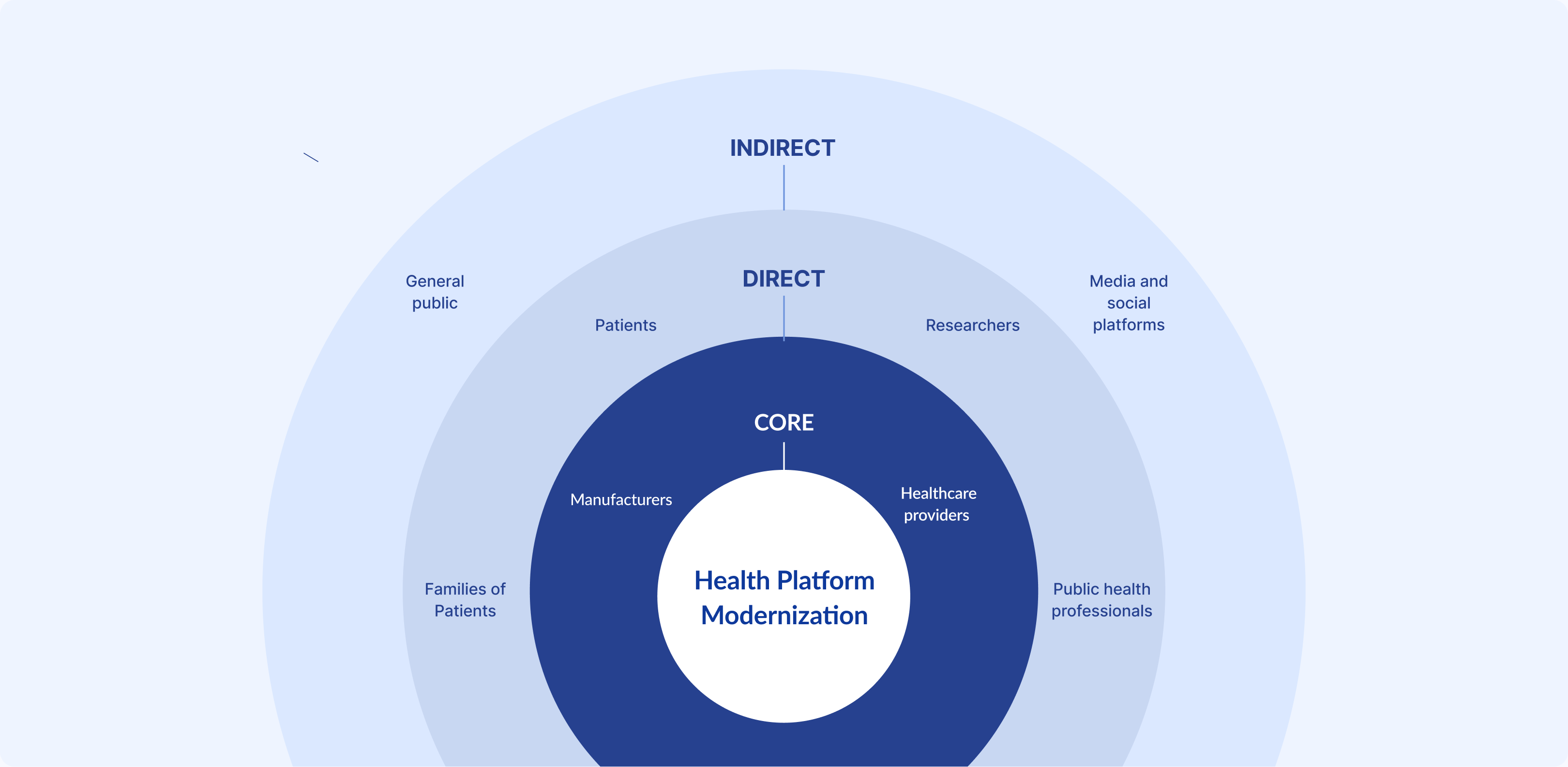
The challenge wasn't simply making reporting easier. It was balancing user trust, government requirements, and the client's vision for AI within a single experience. With these insights, we developed solutions that addressed the needs of everyone involved.
Insights to Decision: Decision #1
AI Needed to Build Trust
Any AI integration would need to increase confidence, not replace it, so rather than removing AI, we repositioned it as an optional guide for finding information and clarifying terminology keeping users in control of what they want to share while preserving the client's vision.
Insights to Decision: Decision #2
Designing for Returning Users
Many participants repeatedly reported the same information. We created user profiles that securely pre-filled recurring details, enabling faster submissions and personalized guidance based on seasonal updates or recent health events while giving users a reason to return and access their health information in one place.
Rebuilding the Foundation
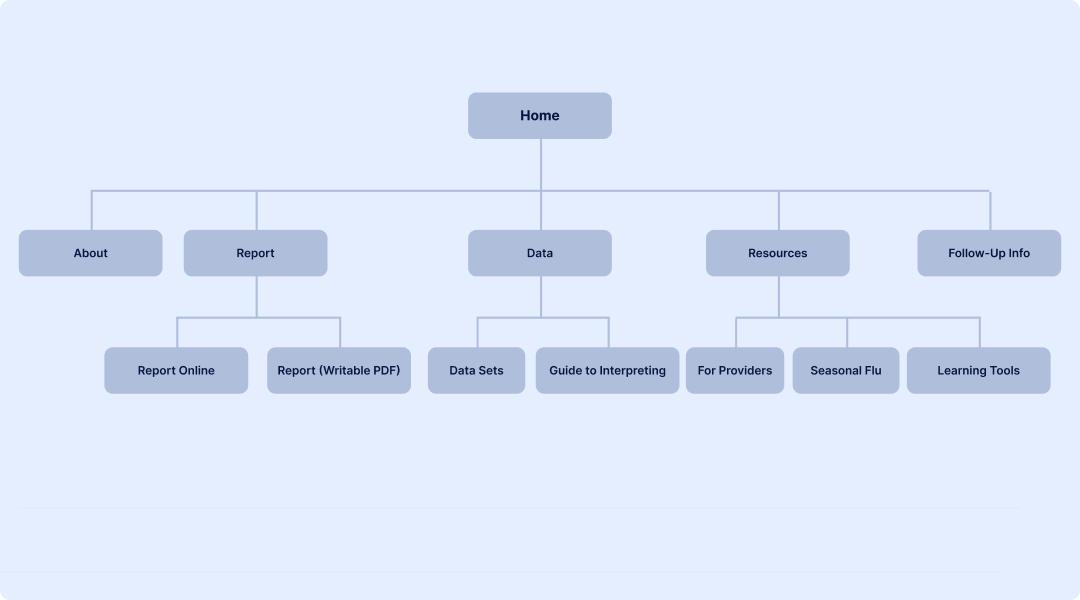
Rebuilding IA Around User Goals
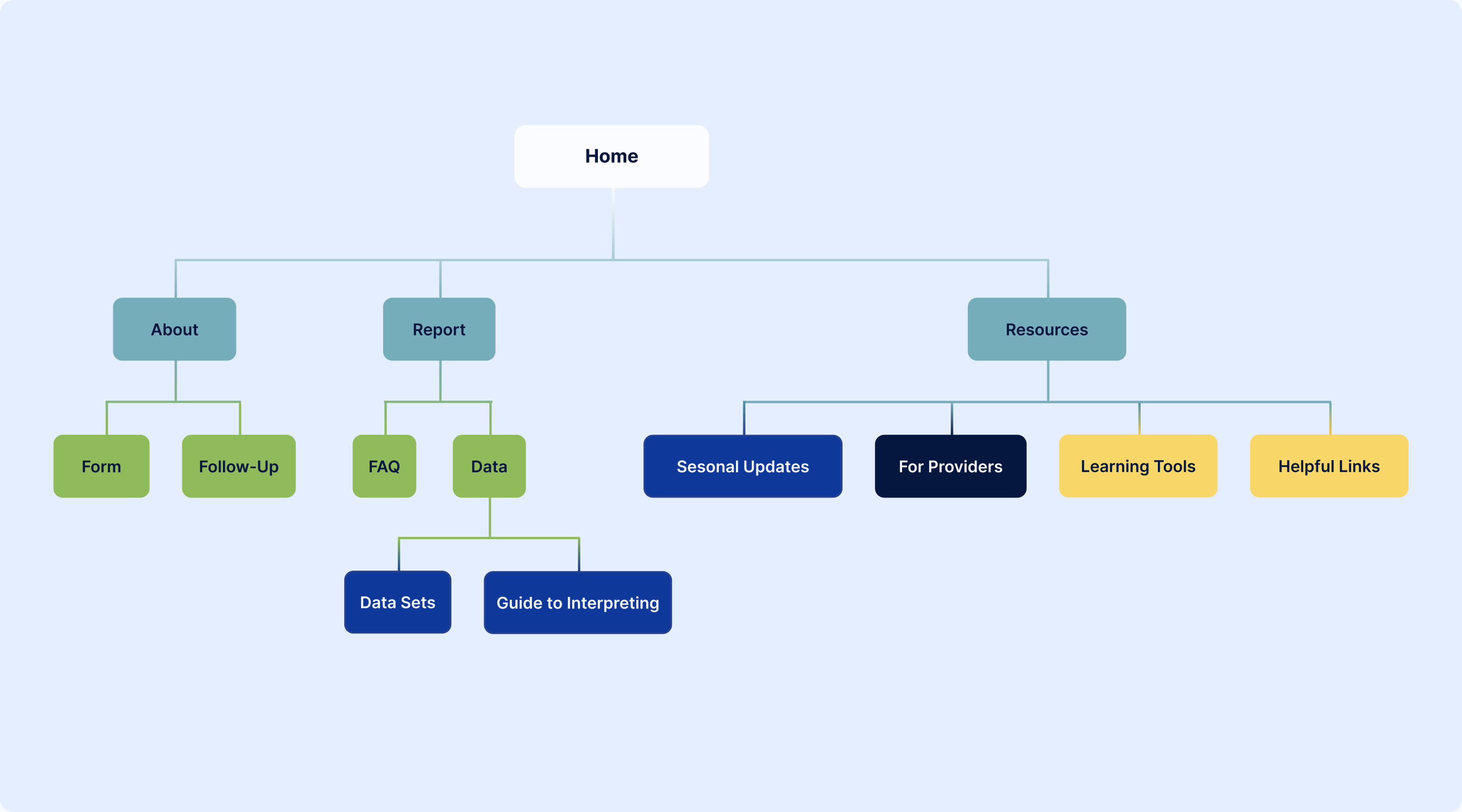
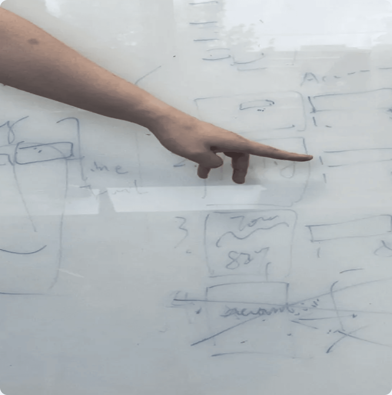
We evaluated the existing information architecture to understand where users struggled most. Tasks and information were mixed together, making key actions difficult to find. Related content was scattered, forcing users through disconnected experiences. Navigation reflected internal processes rather than user goals, increasing confusion throughout the reporting journey. Instead of reorganizing pages around departments or system structure, we rebuilt the experience around the questions users came to answer and the tasks they wanted to complete
Rebuilding the Foundation
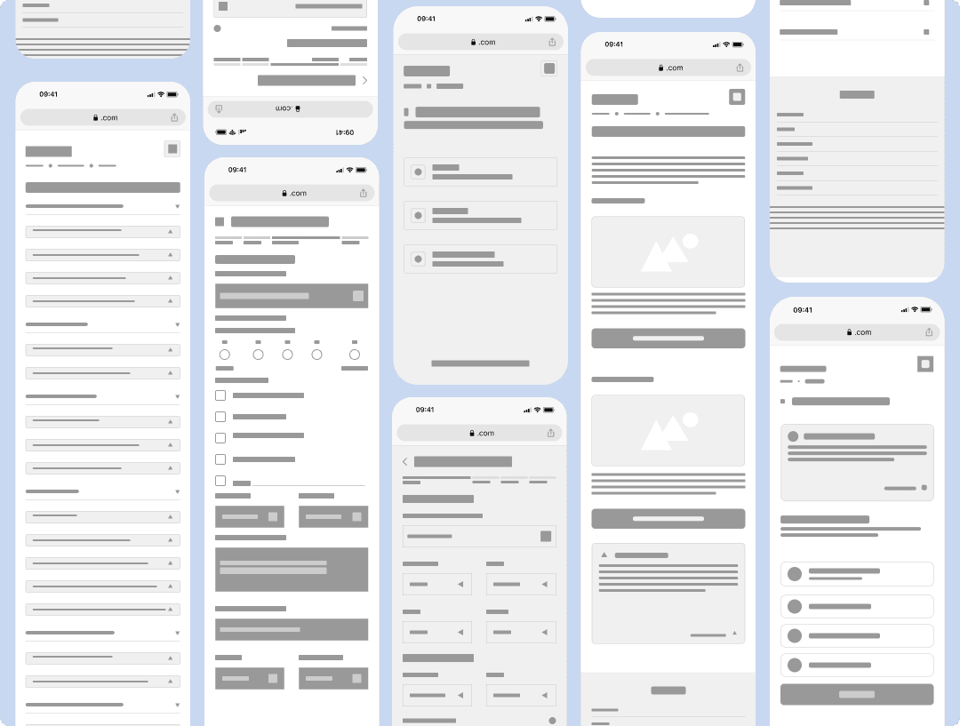
Turning Structure Into Screens
With the navigation simplified, we began translating the new information architecture into wireframes. Rather than designing high-fidelity interfaces immediately, we explored multiple layouts, tested reporting flows, and refined interactions before committing to visual design.
Rebuilding the Foundation
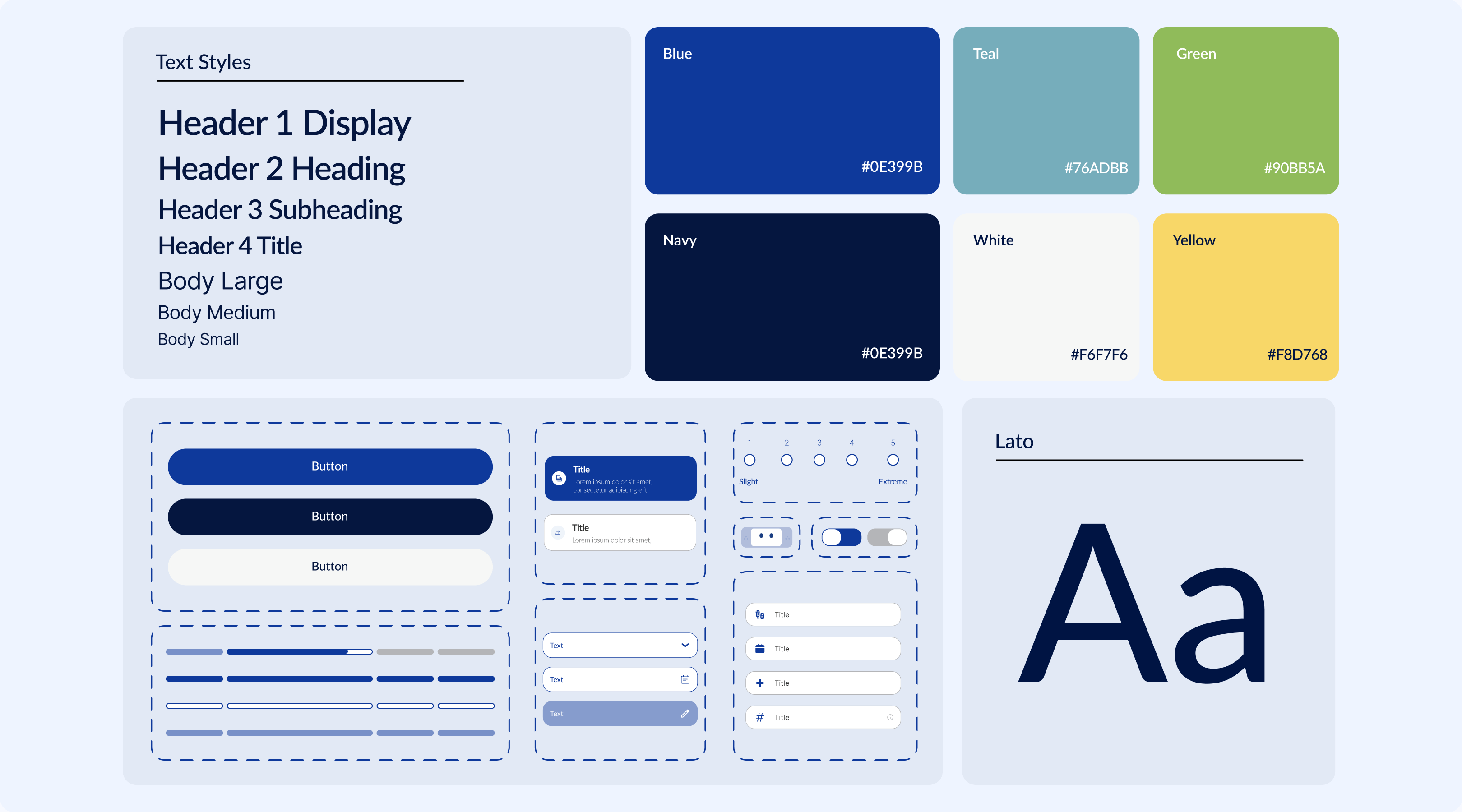
Revamping the Visual Style
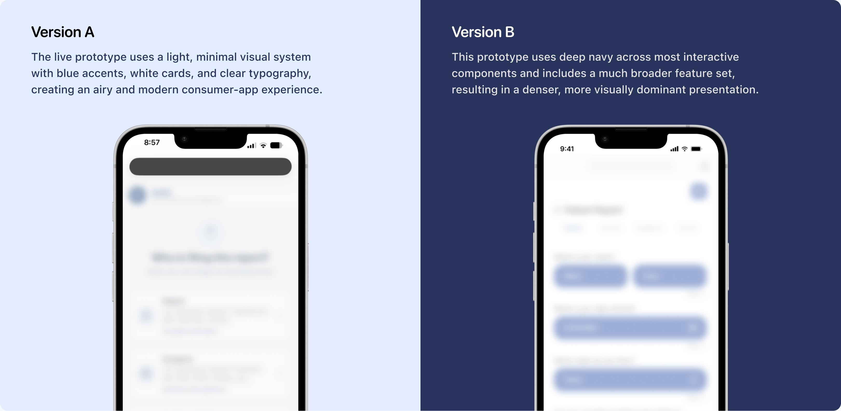
I designed three stylescape directions, each translating a typography and color system into applied UI components and photography treatment, so the client could evaluate a modernized design system option side by side.
Rebuilding the Foundation
Prototyping a Scalable Component System
I designed a reusable search and filter component with Claude Code combining free-text search with a dropdown. This let users search naturally while selecting standardized options reducing input errors, and mismatched data.
Location
User Testing
Refining Through Feedback
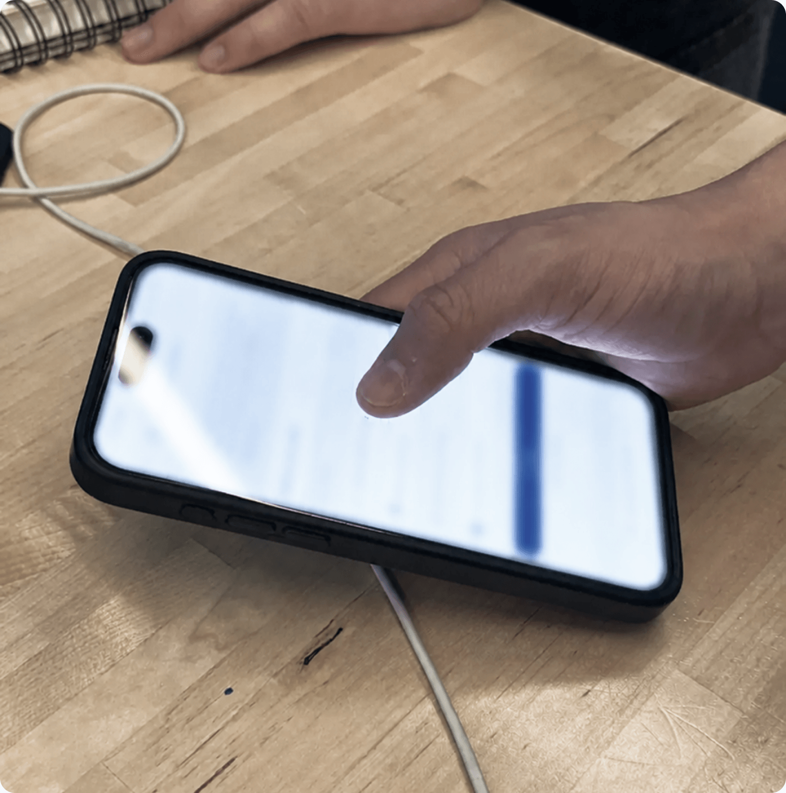
After two weeks of design, I conducted usability and A/B testing with different component variations to identify remaining friction and gather feedback. The findings informed key refinements that improved clarity and confidence.
Solution #1
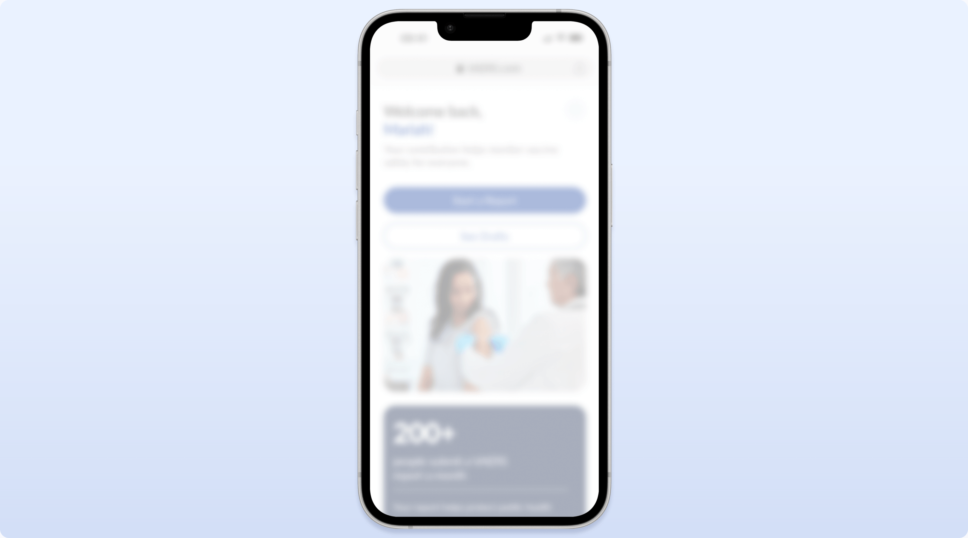
System Integrated Reporting
Syncs relevant records across connected systems and auto fills recurring information to reduce manual entry. This minimizes repetitive work, improves accuracy, and saves time for returning users.
Solution #2
Fast-Track Form
A simplified form for prepared users, optimized for completion in under two minutes. This enables experienced users to complete submissions with minimal friction.
Solution #3
Guided Form
A step-by-step experience with plain language, progressive disclosure, and clear progress indicators. Clear guidance helps users feel more confident and reduces abandonment.
Solution #4
AI Assistant
An in-platform chatbot that answers questions, provides guidance, and reduces confusion throughout the process. Instant support helps users stay on task without leaving the workflow.
Solution #5
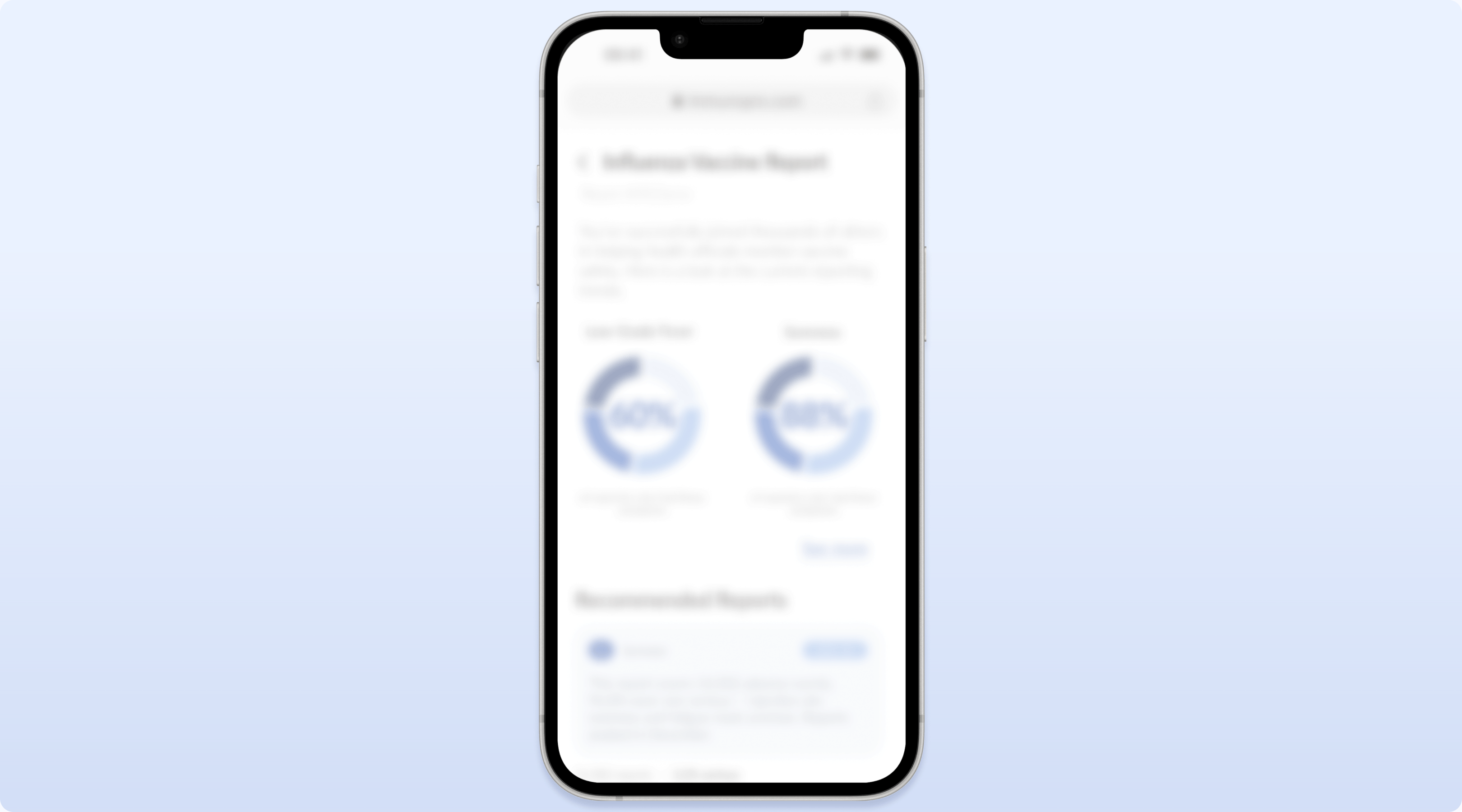
Educational Follow Up
We designed dedicated pages for an educational follow-up view to provide, contextual guidance, and reassurance. Users could compare their report with population-level statistics, helping them understand whether their experience was common or expected without relying on unreliable online searches
Beyond the Product
Awareness Campaign
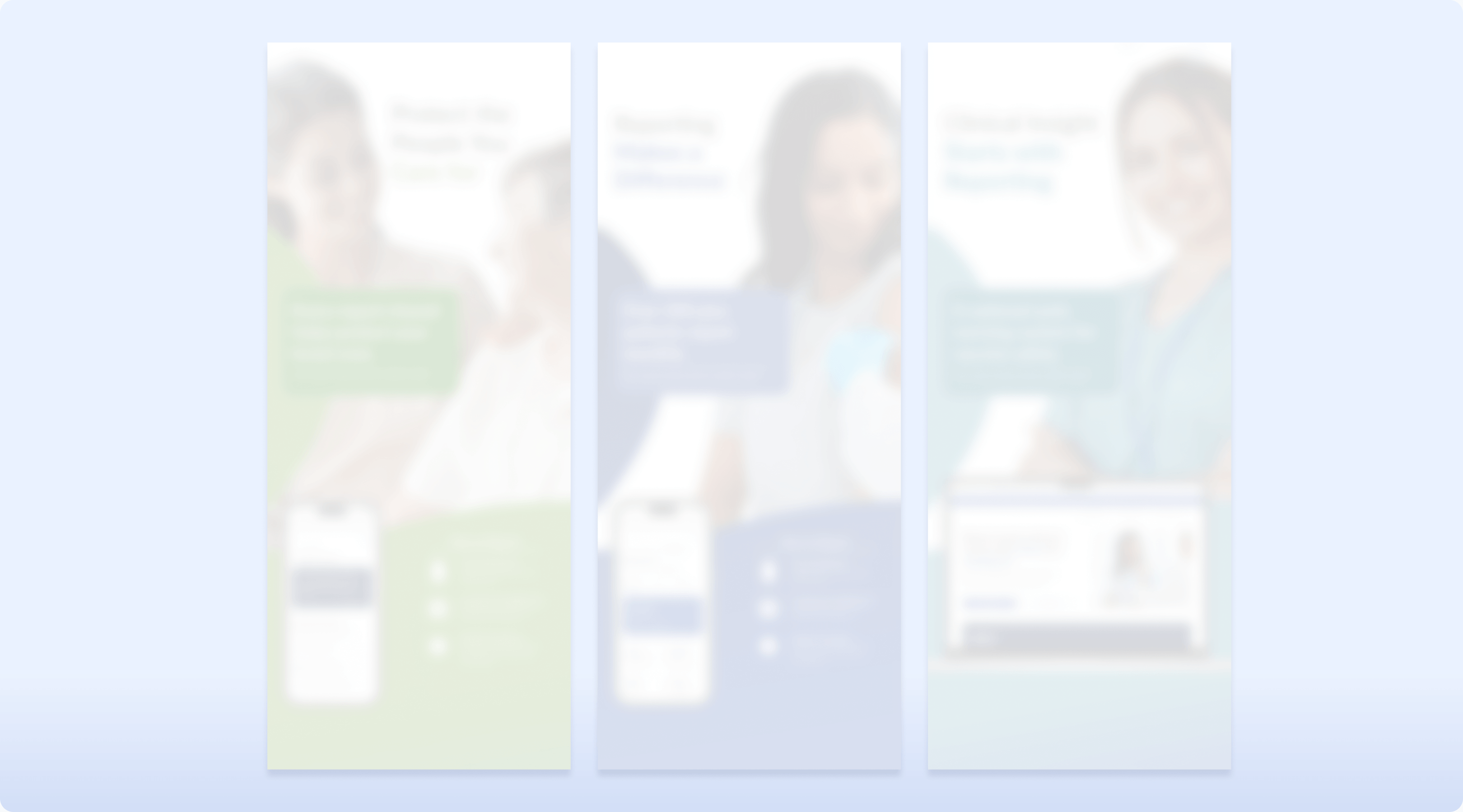
Research showed the challenge wasn't just usability it was awareness. Many users didn't know the platform existed or understand its purpose, limiting participation and trust. I contributed to the campaign's art direction and designed its posters to: Build Awareness: Introduce the platform and its purpose. Explain the Why: Show its value and impact. Build Trust: Reinforce credibility through data and recognizable branding. Simplify Action: Make the reporting process clear and approachable. Drive Participation: End with a clear CTA and accessible QR code.
Key Learning #1
Storytelling Creates Buy-In
Learning from my professor, I realized that a polished interface isn't enough if people don't understand why the decisions were made. Connecting the problem, research, and solution through storytelling and presentation makes it more impactful.
Key Learning #2
Think Beyond The Product
At first, I thought redesigning the interface was the solution. Research showed me that awareness was just as important because even the best experience can't help people if they don't know it exists.
Key Learning #3
Research Drives Decisions
Not every stakeholder wanted the same thing, so I learned that design is about making tradeoffs. Going back to the research helped me explain and support those decisions.
Feedback from my team
Austin Webster
Project Manager | Professor SCADpro
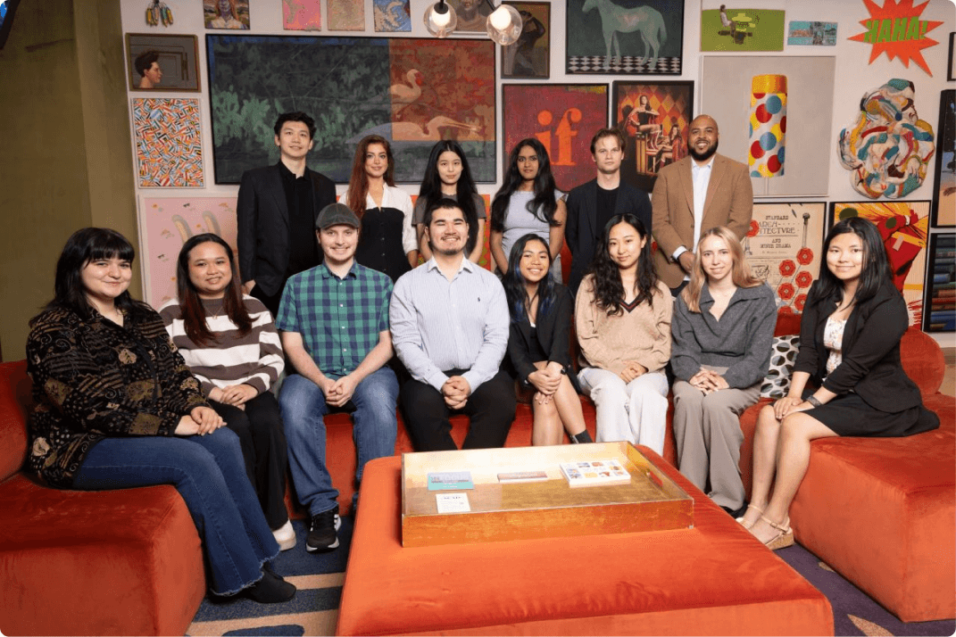
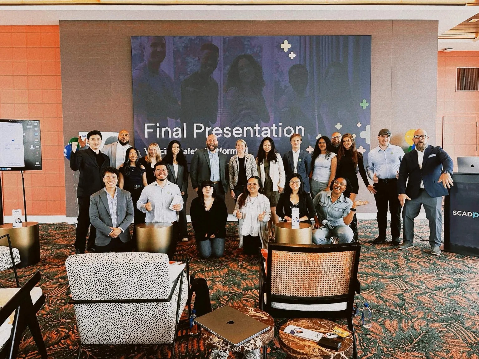
“Audrey brought a passionate dedication and tenacity to her role as Creative Lead that helped guide the visual direction of the studio, while also inspiring her fellow designers to push further in gathering research, producing insights, and creative solutions for our client. She was an outstanding student and is always welcomed as a leader in any one of my future studio classes.”